As a demonstration of a translating ai workflow and the current capabilities of some of the leading platforms / models for academic or language type work, I present the workflow I just completed for having ai re-translate the article “Von dem Namen Lutheraner”.
NOTE: my own hand translated 2019 version is here with links to the original source:
Step 1 -> The Original Source Document
I have the original source document as an 1844 printed text. This was the source for the original 1989 and 2019 translations.
However, for this effort there is a .pdf w/OCR courtesy of Google Books as cited on this page:
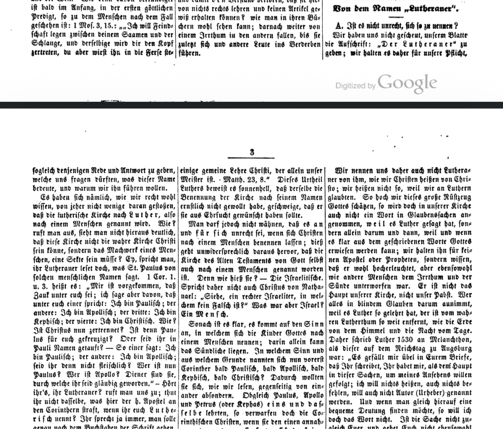
Just for visual effect here are a couple of screenshots of the first two pages of the article in the original, part of Volume 1, Issue 1, pages 2 and 3:
This text was digitized by Google and OCR data is embedded in this text meaning the text was scanned by Google and OCR software was used to embed information word by work into the text. This enables .pdf word searches and so on which would not normally be available on a pure image scan.
Step 2 -> AI Improvement of the OCR data
Because of the Fraktur typescript (font, abbreviations etc) used in 19th century. German publications like this as well as the age of the texts, OCR scans are notoriously of poor quality, sometimes achieving only 80% or less accuracy. [1]
So the first step was to use AI, in this case Grok, to follow this process:
- Extract the article (about 10 pages) from the larger text of Volumes 1 to 3. (almost 400 pages)
- Review the OCR and provide an improved German text which would be the basis for the AI translation. This was created as an .md file initially. This is a popular and efficient and non graphical file format for computers generally but also ai to work with. The review, extraction, and improvement of the OCR scan was completed with Grok (Elon Musk, X). This only takes a few minutes, even less.
- This was converted to a .pdf. This I did with Claude (Anthropic) because it has modes or setups that work much more easily with local files and also it does a nice job creating clean .pdf files. This also takes a few minutes. You can see the result here: https://mdnispel.work/wp-content/uploads/2026/03/VonDemNamenLutheraner_Grok2026-CorrectedGerman.pdf
Step 3 -> Translations by Two Models
- Next I had both Claude and Grok attempt A. A new translation B. Creation of some editorial content. The translation by Grok took very little time, just a few minutes and later revisions in seconds. It was very impressive. Claude took longer maybe 20 to 30 minutes. Still very impressive. It make me recall and lament how many long early morning hours before going to work or weekend hours it took me to do this the first time and even the second time by hand.
- I gave some revisions in terms of style directives. In the end I chose the Grok translation and the Claude editorial material as my favorites. I had these put together by Claude and then did a final review and myself by hand. Again this was created in a .md file format.
- I had Claude create a clean stylized .pdf from the .md file.
All in all this took a few hours of work. Half of that can be improved upon in the future as I am now familiar with the workflow and the strengths and weaknesses of these two models in this work. The final result can be viewed here:
“About the Name Lutheran” – Translation by MDNispel (@ai_lutheran) with AI models / tools, namely, Grok and Claude.
About the Name Lutheran_Nispel2026
- Summary from Grok regarding Fraktur:
Fraktur is a style of blackletter typeface (also called gebrochene Schrift or “broken script”) that originated in early 16th-century Germany, based on calligraphic hands like Bastarda. Its name derives from Latin fractus (“broken”), referring to the characteristic angular, fractured strokes that break continuity—sharp angles and distinct breaks contrast with the smooth curves of Roman/Antiqua typefaces.
Key characteristics:
- Dense, ornate, and highly decorative with thick/thin contrasts and pointed arches (e.g., in letters like o, a, b).
- Includes features like the long s (ſ), Eszett (ß in ſʒ form), and various ligatures from handwriting traditions.
- Became the dominant German printing typeface from the Reformation era through the early 20th century (used in Der Lutheraner and most confessional Lutheran publications), symbolizing “German” identity in contrast to “Latin” Antiqua.
It fell out of official use in Nazi Germany (1941) but survives today in decorative contexts, logos, and historical reproductions. For transcription/OCR work on 19th-century scans (as in @ai_lutheran or mdnispel.work projects), recognizing its broken forms is essential for accurate reading and digital conversion.